
An existing product foundation
The trading backend was in place. The brand system, interface experience and presentation still needed to be developed for the competitive TON ecosystem.

BRAND DESIGN · PRODUCT EXPERIENCE · LAUNCH CREATIVE
For this TON-based trading aggregator, DPIX designed a connected brand and product experience: visual identity, a 3D mascot, web and game interfaces, Telegram emoji, motion posters and an advertising teaser. Content strategy and creative direction brought these outputs into the go-to-market programme.
Explore the case study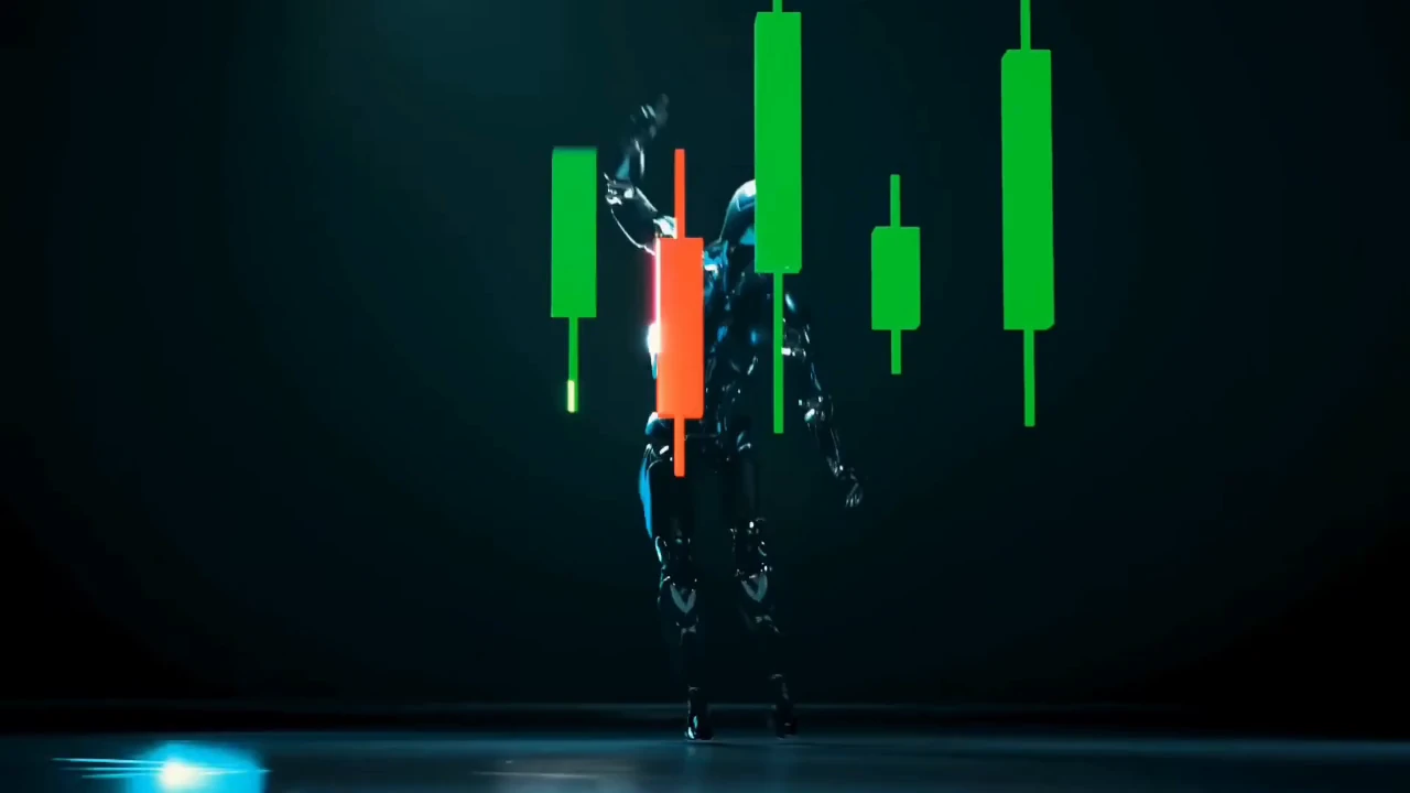
01 / THE BUSINESS CHALLENGE
MyTonSwap already had its trading-aggregator backend when DPIX joined. Our brief was to define the brand, product interfaces and communication around it, so the website, game experience and community channels presented a coherent product.
The trading backend was in place. The brand system, interface experience and presentation still needed to be developed for the competitive TON ecosystem.
We connected the mascot, color system, interface details and campaign content through shared visual rules. Each touchpoint became part of the same product identity.
Scope of work
02 / BRAND IDENTITY & CHARACTER
The identity brought the wordmark, green-on-dark palette, composition and robot mascot into one visual system. These elements were designed to work together across interface screens, social profiles and campaign media, rather than appear as separate graphic treatments.
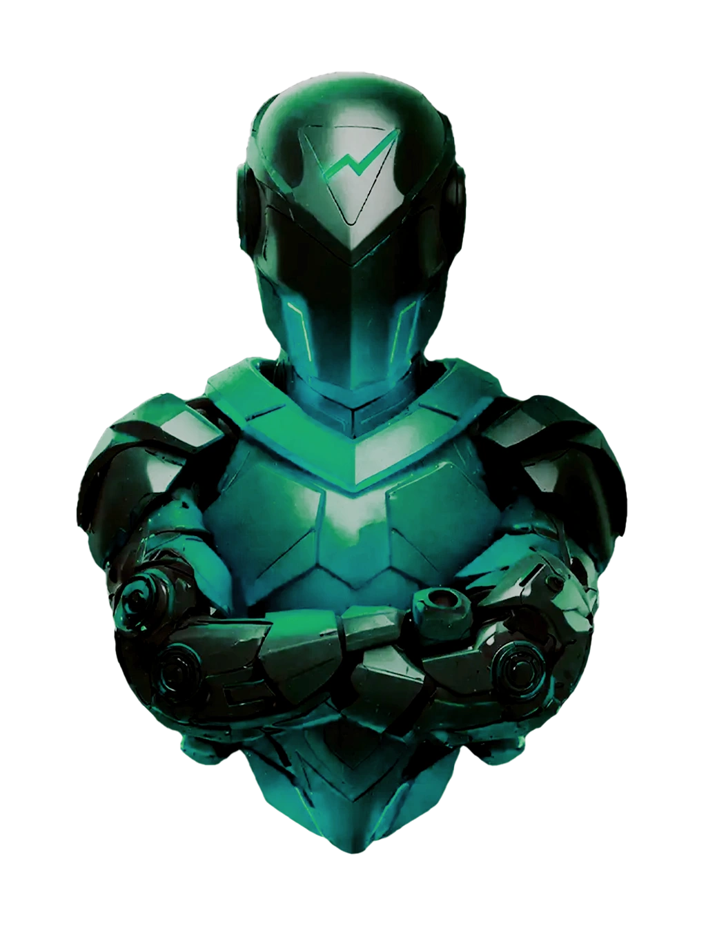
Move horizontally to rotate the original 3D mascot.
The robot gave product introductions and campaign visuals a recurring focal point. Its form and material language could carry across still artwork, 3D scenes and animated compositions, giving the brand a consistent character in different formats.
The recurring robot and green-on-dark palette establish the brand’s visual language. Shared composition and motion rules carry it across product screens and campaign formats.
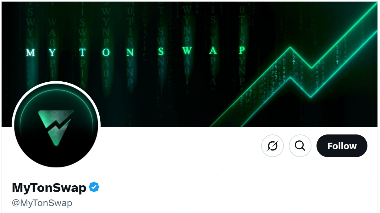
Prepared for MyTonSwap’s X profile, the header carries the same character, palette and composition rules as the product and campaign artwork.
03 / INSIDE THE PRODUCT
Website and game interface design brought the identity into the product itself. Page hierarchy, screen layouts and product widgets used the same visual language as the brand, connecting product interaction with its public presentation.
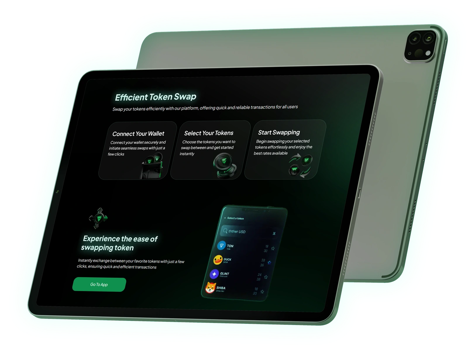
Page hierarchy, screen composition and interface details for the trading product’s website.
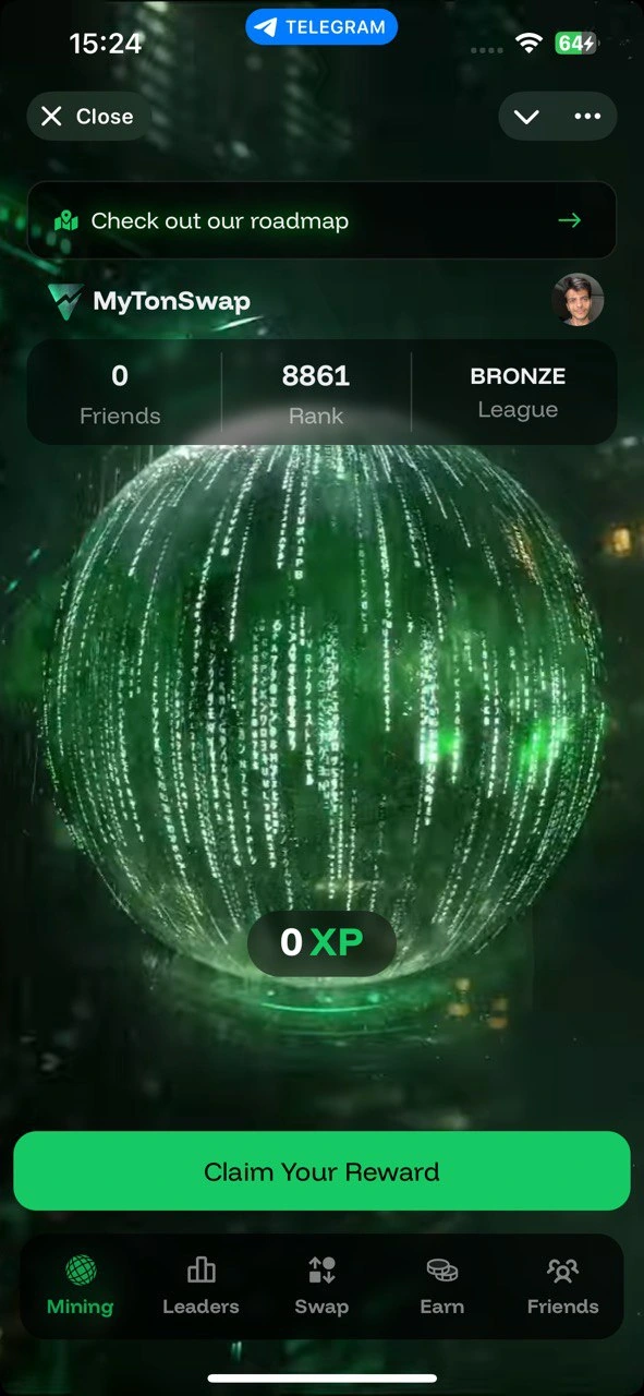
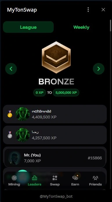
Screen layouts and visual interaction details for the project’s game and Telegram mini-app experience.
Brand-aligned interface elements for recurring product interactions.
The Telegram mini-app layouts apply the brand to compact navigation, progression and reward screens. The product’s visual language stays consistent as the interface moves from web to mobile.
04 / TELEGRAM COMMUNICATION
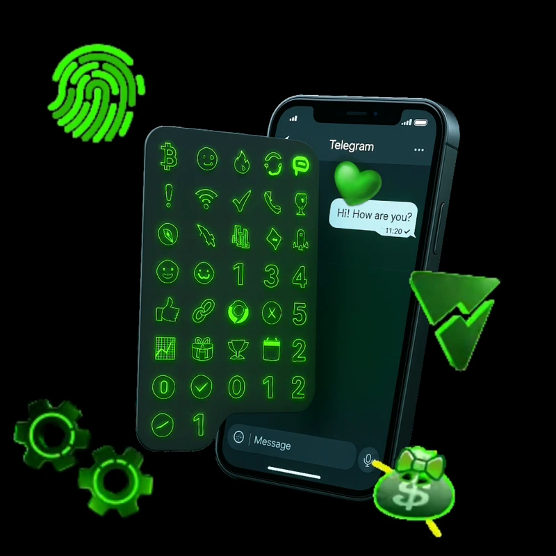
We extended the identity into custom emoji, reaction symbols and message-level graphics. Designed for Telegram conversations, these assets kept the product’s character present in everyday community communication.
Custom emoji bring the brand into everyday community conversations.

05 / THE SYSTEM IN MOTION
Motion posters brought feature announcements, collaboration messages and educational content into the same visual system. Typography, 3D elements and looping motion gave each message its own composition while keeping the campaign visually consistent.
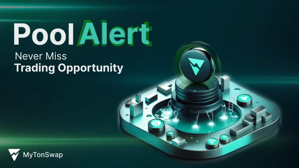
A focused motion poster introducing pool alerts through branded typography and graphic accents.
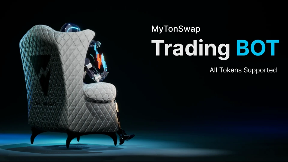
A character-led composition combines the trading-bot message with animated typography.
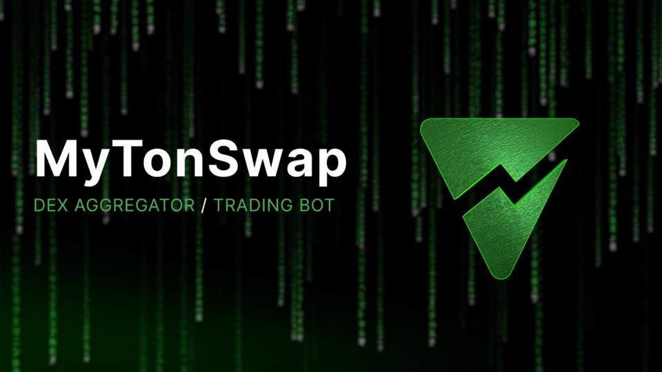
A looping composition applies the visual identity through animated graphic elements.
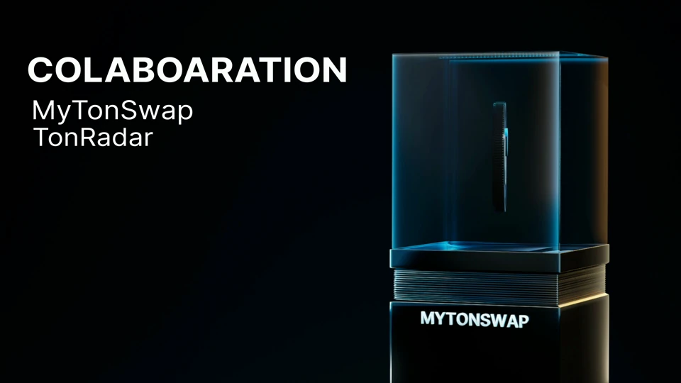
A collaboration announcement structured around the partner names and MyTonSwap’s visual language.
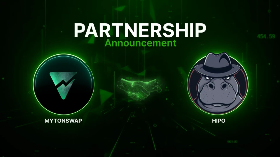
The Hipo announcement, presented through branded typography and motion.
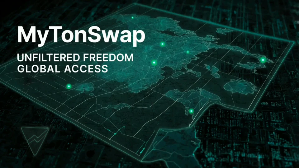
An animated world map gives the campaign’s access message a geographic visual form.
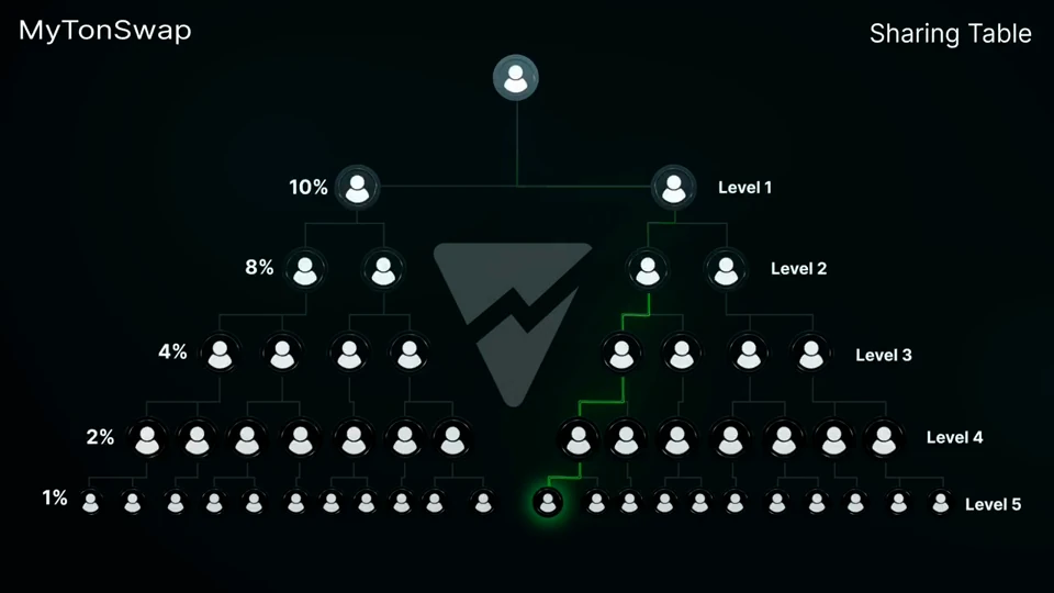
Animated typography and graphic elements guide attention through the sharing-table message.
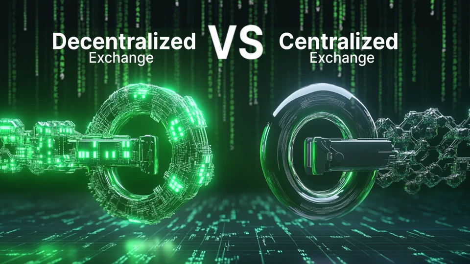
An educational comparison presented through animated type and graphics.
Motion artwork announcing the first phase of the ambassador programme.
06 / LAUNCH STRATEGY & CREATIVE
Content strategy and creative direction connected the brand and interface work to the go-to-market programme. We developed campaign media and an advertising teaser, then prepared graphic and motion assets for the project’s website and community channels.
The product introduction, campaign subjects and visual identity were brought into one communication plan.
Rendering, animation, graphic-data optimization and format preparation supported delivery across the project’s digital touchpoints.
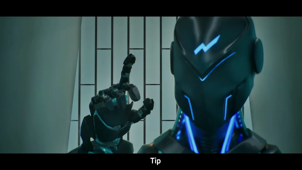
The film uses a chess-inspired narrative and the robot mascot to introduce MyTonSwap. Trading references, 3D scenes and a branded end card bring the campaign’s visual direction into one complete sequence.
07 / THE PROJECT OUTCOME
Project records report approximately 6,000 active users over the complete, approximately 70-day go-to-market period. DPIX’s delivery covered the brand system, product interface design, Telegram communication assets and campaign creative used during that programme.
Active users across the complete GTM period, according to project records.
The campaign period covered by the reported user count.
DELIVERED ASSETS
A coordinated set of brand, interface and communication assets: the mascot, website and mini-app design, product widgets, Telegram emoji, motion posters and advertising teaser.
Strategy · Creative direction · Brand and product design · GTM
Rendering · Animation · Graphic-data optimization · Technical asset delivery
Additional asset production under the project’s creative direction.
Bring the brand, product experience and launch communication into one plan. Start with a review of your business needs.
