01 / 03
Keep the brand character visible.
Dark backgrounds, recurring motifs and warm accents gave the communication a consistent character. The hat-wearing chess piece is one motif in the supplied project artwork.



MAFINESS / BRAND IDENTITY & EVENT DESIGN
DPIX partnered in defining and applying Mafiness’s visual language across teaching material, event communication and digital content. This case brings selected designs together with evidence of their real-world use.
See the design in use01 / WHY THE PROJECT WAS NEEDED
Mafiness, led by Rasoul Naseri, had a clear position in business coaching. Its visual communication was fragmented: posters, presentations and event materials did not consistently express the same authority.
WHAT DPIX CHANGED
DPIX defined a visual system, then directed its use across four seminars and two educational programs. Each new piece strengthened the same brand presence.

02 / THE DESIGN DECISIONS
Three connected decisions shaped the work: a distinctive motif, shared design rules and a clear way to present ideas.
Dark backgrounds, recurring motifs and warm accents gave the communication a consistent character. The hat-wearing chess piece is one motif in the supplied project artwork.
Logo, portrait, palette and message hierarchy became a shared framework. A new format no longer meant starting the brand’s identity from scratch.
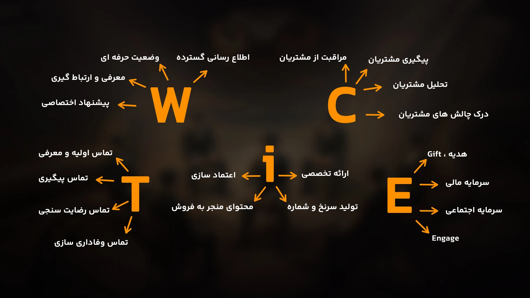
SIGNATUREPALETTEPORTRAITHIERARCHYIllustration and diagrams gave sales concepts a clear visual structure. In TWICE, five connected ideas become one composition the presenter can explain on stage.
03 / DESIGN IN USE
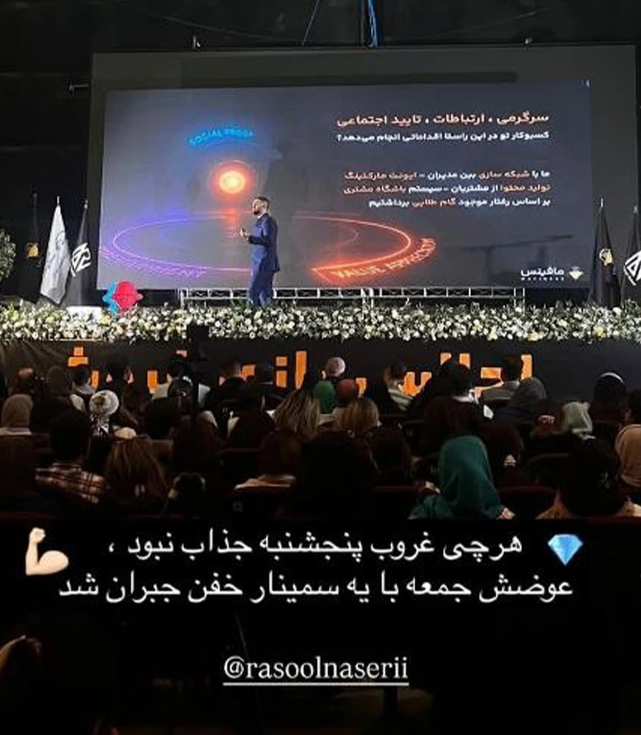
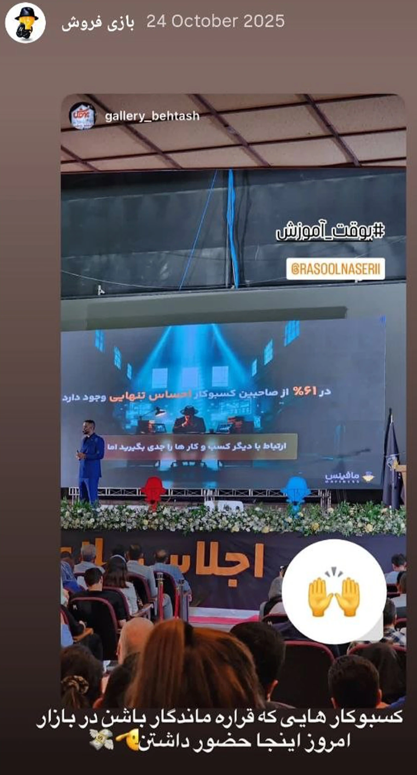
Examples of the Mafiness identity in teaching material, event collateral and images shared from the events.
The project’s visual language appears in slides presented in a real teaching setting.
View event archive View supporting evidence05 / SELECTED DESIGNS
Original teaching artwork and concept presentations of the event identity. The real-use archive above documents what can be observed in the supplied event photographs.
06 / WHAT REMAINED
After reviewing later executions and attending subsequent Mafiness seminars, we saw the visual language we designed continuing across the stage, presentations and brand materials.
Observed in later Mafiness seminars.
Seeing the system continue after our engagement ended showed us that the work had grown beyond a set of isolated deliverables and become something the brand could keep using in practice.
When your business’s reputation has outgrown its visual identity, DPIX connects brand strategy, art direction and design into a coherent presence. Start with a strategic conversation about your brand.